Summary
Separate teams built CloudGuard’s domains with no shared standards, so the interface looked and behaved differently from one area to the next.
I audited recurring patterns, built the design foundations, assessed third-party components and worked with front-end teams to bring them into the product.
One design system, delivered through the move to React, with third-party components for complex controls.
Context
CloudGuard is Check Point’s cloud security platform, spanning posture management, network security, identity, workload protection, and more.
Three front-end teams built these domains, some owning more than one, in AngularJS or React, with no shared standards to work from. Every team solved common interface needs in its own way, and the product was moving from AngularJS to React.
Problem
CloudGuard’s interface looked and behaved differently from one product area to the next.
How can separate teams build one consistent product?
Constraints
- One designer, new to the domains, across a large product
- The product was mid-migration from AngularJS to React
UI audit
Method
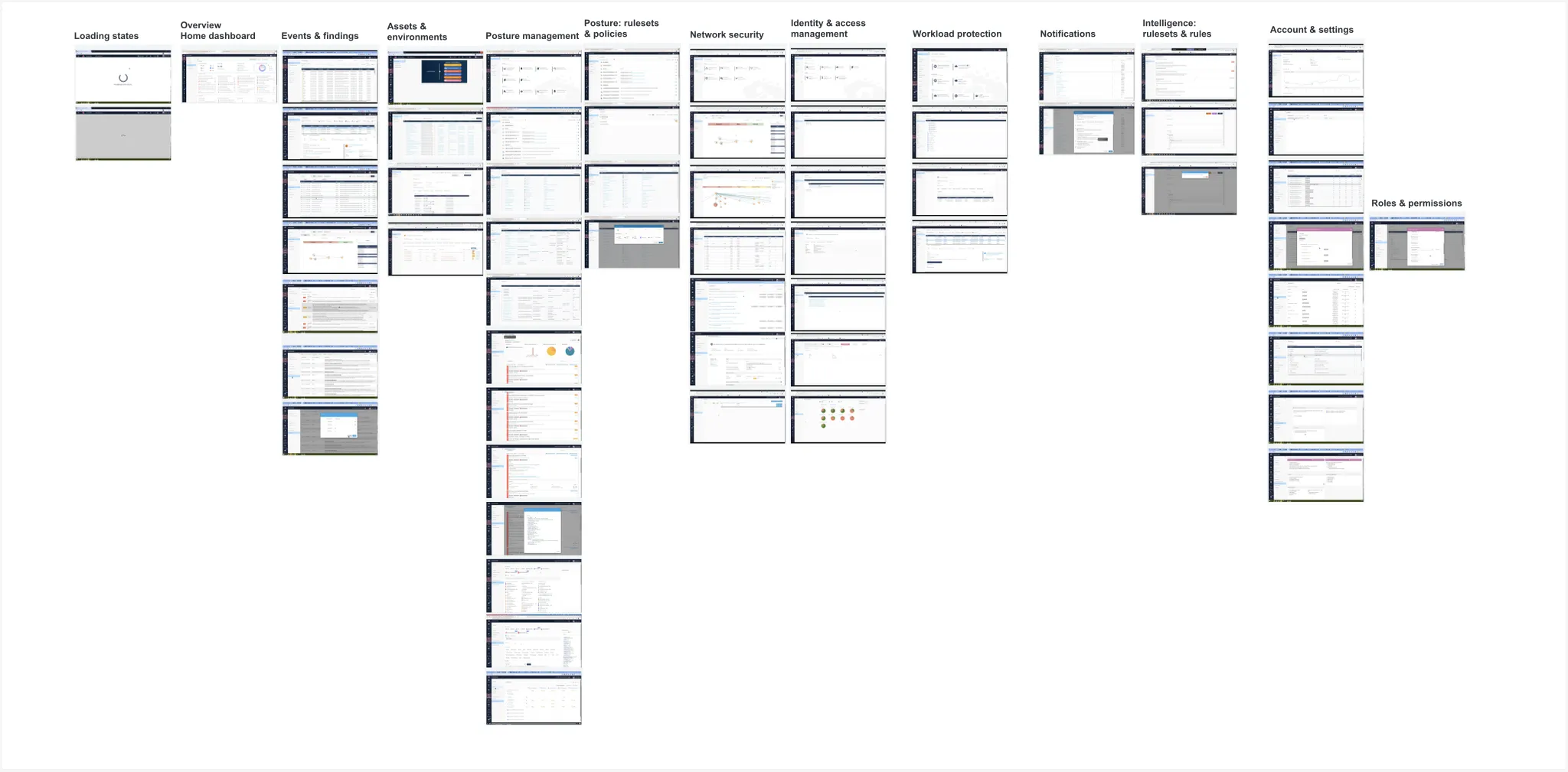
- Capture recurring UI elements — I walked through every product area and recorded the elements used.
- Group by purpose — I brought together elements that do the same job.
- Compare visual treatments — I identified where the same job was handled differently across the product.
Findings
Actions with no clear hierarchy
Primary buttons came in seven colors, one form had three filled buttons side by side, and “add” was worded five ways.
The same control, rebuilt per page
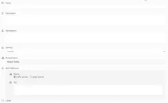
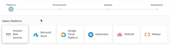
Six tab styles, toggles as both switches and pills, three ways to label a field, four table headers.
One meaning, many visual languages
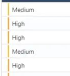
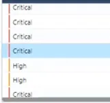
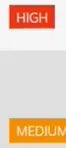
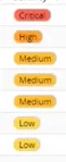
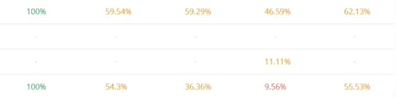
Severity, the key signal in a security product, appeared in six forms: colored text, filled badges, pills, flags, labels and colored percentages.
Detail opens in a different place each time
An object opened in a drawer, a tab, a side panel or a modal, depending on the area.
Meaning carried by color alone
Status was mostly an unlabelled icon; severity and compliance relied on red, orange and green.
Missing states
Two loading treatments, one designed empty state and no error states.
Evidence
Navy / dark
-
 Assets
-
 Assets
-
 Events
-
 Posture Management
Blue
-
 Assets
-
 Posture Management
-
 Settings
-
 Network Security
Pink
-
 Identity
Mixed fills in one form
-
 Intelligence
Destructive red
-
 Intelligence
Labels with icons
-
 Intelligence
Left labels
-
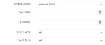 Events
Checkbox groups
-
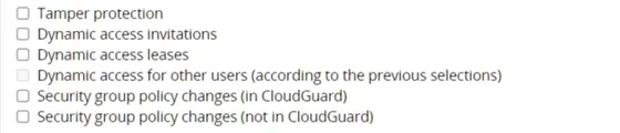 Settings
-
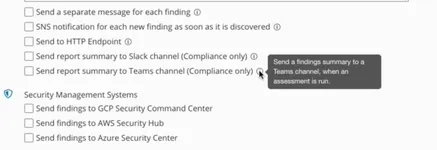 Settings
Radio + time selects
-
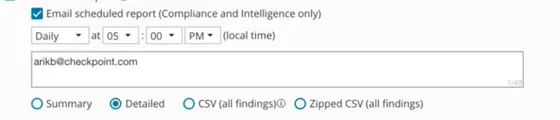 Settings
Switch
-
 Posture Management
-
 Network Security
Toggle pills
-
 Posture Management
-
 Network Security
Wizard stepper + tiles
-
 Posture Management
Uppercase text tabs
-
 Assets
-
 Assets
-
 Assets
Boxed tabs
-
 Events
-
 Network Security
Drawer tabs
-
 Events
-
 Events
Underlined sub-tabs
-
 Network Security
-
 Identity
Time-range tabs
-
 Events
-
 Settings
Platform tabs with icons
-
 Posture Management
Text with colored bar
-
 Events
-
 Events
Filled uppercase badge
-
 Events
Pill
-
 Assets
Corner flag
-
 Posture Management
-
 Posture Management
Label
-
 Intelligence
-
 Intelligence
Colored percentage
-
 Posture Management
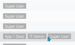
Gray role chips
-
 Settings
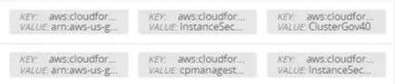
Key / value tag chips
-
 Network Security
List chips
-
 Network Security
Count chips
-
 Posture Management
Tactic chips
-
 Intelligence
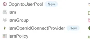
"New" and "Preview" badges
-
 Posture Management
-
 Posture Management
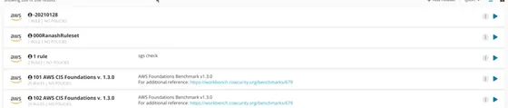
Ruleset rows
-
 Posture Management
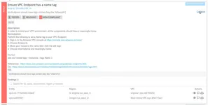
Assessment rule card
-
 Posture Management
-
 Posture Management
Posture rule row
-
 Posture Management
Intelligence rule card
-
 Intelligence
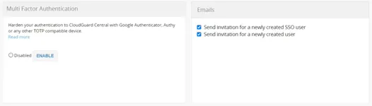
Settings block
-
 Settings
-
 Settings
-
 Settings
Dashboard widget
-
 Overview
-
 Identity
Approach
Fix the UI first, structure later
- Problem
- The audit revealed information architecture, navigation and UI consistency issues. As the sole designer and new to the project, I couldn’t address them all at once.
- Decision
- I addressed UI inconsistencies first—action labels, controls, tables and forms—using shared patterns, and left information architecture, navigation and user flows for later stages.
Unify through the React migration
- Problem
- Separate teams needed consistent visual rules while the product moved from AngularJS to React. Aligning individual screens would leave those rules maintained in separate places.
- Decision
- I built a custom design system and made it the styling foundation for screens moving to React, so unification came with the migration rather than as a separate redesign.
Use third-party components for complex controls
- Problem
- Front-end teams were building and maintaining complex controls in-house, including the data grid.
- Evaluation
- I shortlisted components that had the features CloudGuard needed, checked how actively each project was maintained, and assessed how easily we could apply our design tokens to match our style guide. I asked front-end developers to try the candidates and assess their fit with our architecture and the clarity of their documentation.
- Decision
- For the data grid, I recommended AG Grid and secured the VP of R&D’s support to replace our internal grid. AG Grid handled the grid behavior, and our design system supplied the styling.
Solution
I brought recurring patterns into one shared system: action labels, sentence case, tables, forms, modal actions and icons.
I built its foundations in code: design tokens, Tailwind CSS utilities and CSS components. Screens moving to React used them, with thin wrappers around third-party components. Visual decisions lived in the tokens, so one change reached every screen built on them.
Example
Assets / Environments
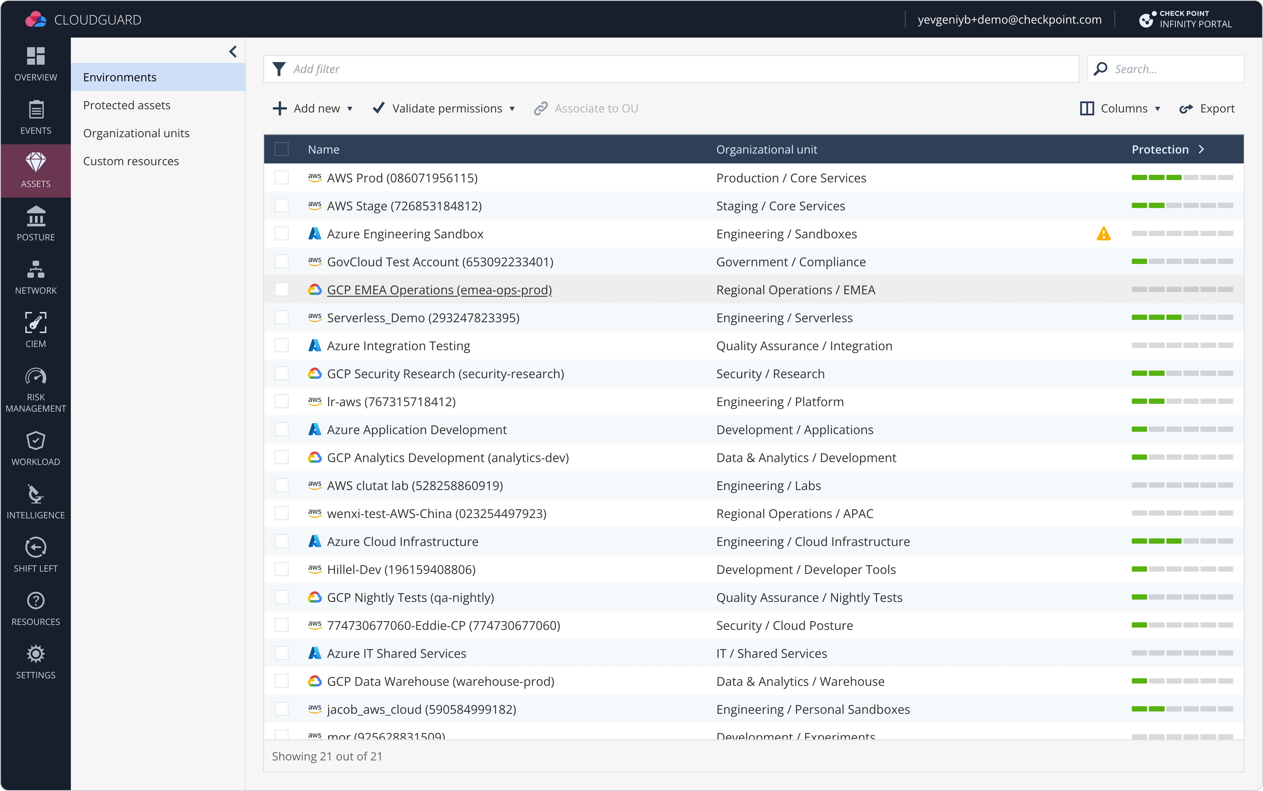
Keep data actions on the left
Keep view actions on the right
Use verb-only labels when context is clear
Use sentence case by default
Group related options in drop-downs
Start every row with an entity icon
Show links on hover only
Limit row icons to entity and status
Group related columns and collapse by default
Show status icons only for issues
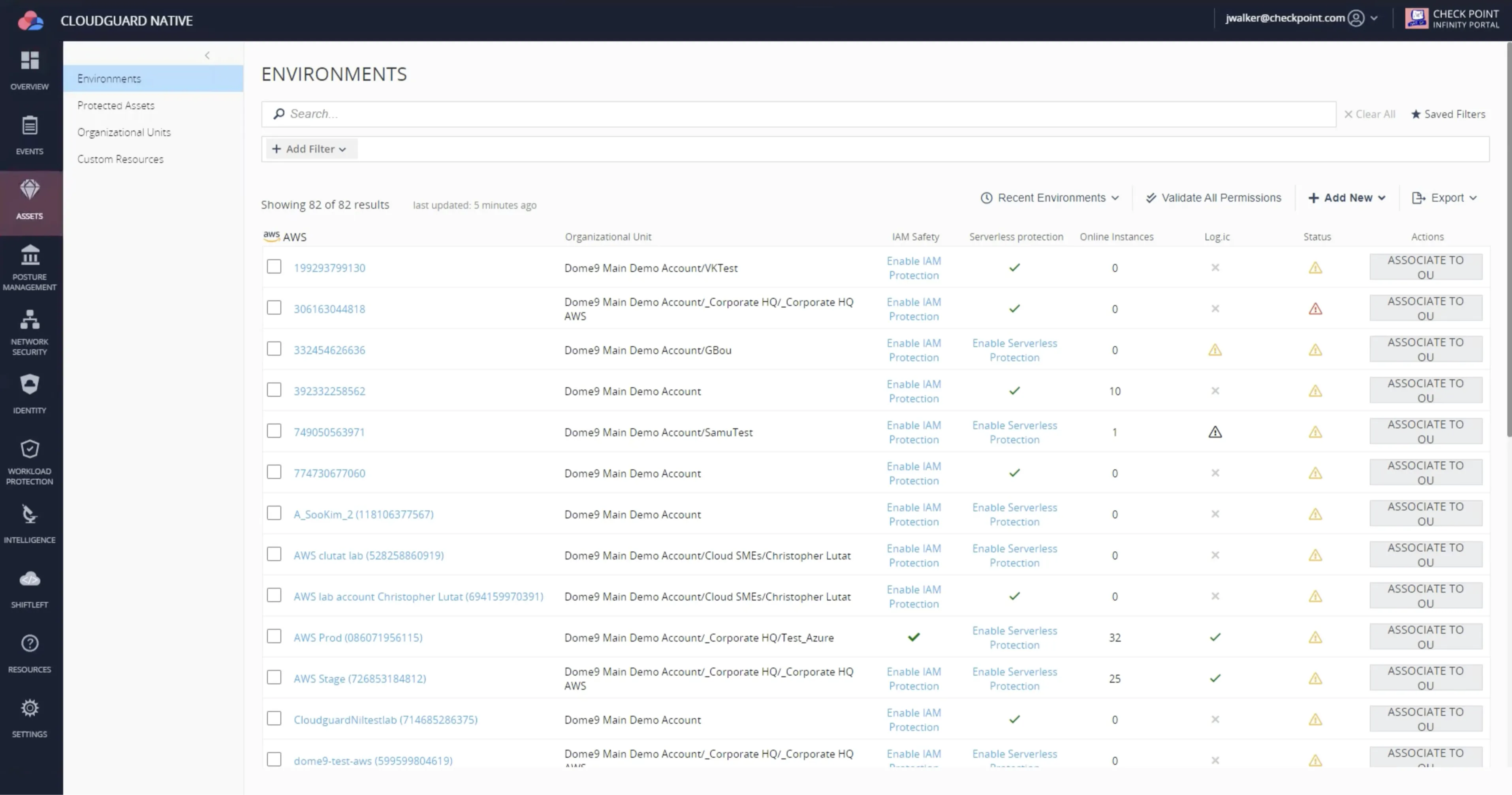
Adoption
I worked with all three front-end teams as I built the design system. They adopted the shared patterns as they moved their screens to React.
The implementation evolved with use. Some developers found Tailwind’s utility classes awkward to work with, and all three teams gradually moved to styled-components.
Impact
3 of 3 teams on the same design system. Teams that had been solving the same interface needs separately now built on one shared system.
~80% of major screens aligned. Alignment came with the move to React, with no separate redesign.
Rebranded easily. The system stayed in use. When Check Point rebranded, well after the work began, some of the implementation was just replacing design tokens.
Fewer UI bugs. UI bugs dropped in some areas, especially the data grid, once AG Grid replaced the internal grid.
What came next
With the UI aligned, I moved on to a navigation redesign and a color system redesign.