Summary
Every component tuned its colors separately for each hue, theme, and state. Similar levels looked inconsistent across hues, and some valid token pairs failed contrast.
The brand palette had to stay as it was.
Two new token layers on top of the palette: strength (lightness) and hue, plus saturation and inverse modes. Components own only a contrast recipe.
Context
CloudGuard helps customers protect thousands of cloud resources. Teams decide what needs attention using three signals: business priority, risk score and vulnerability severity. Each has its own color scale, so statuses are easy to tell apart.
Business priority
How important the asset is to the customer.
- Crown Jewel
- High Importance
- Important
- Low Importance
Severity
How serious the vulnerabilities affecting the asset are.
- Critical
- High
- Medium
- Low
- Info
Risk
Assessment of the asset’s exposure.
- Critical
- High
- Medium
- Low
Problem
As the design system grew, more colorful components were added, and every one of them repeated the same color work.
For example, the Score Tile component needed 320 color mappings: five elements across four UI states, two inverse modes and eight hues. Each new variant multiplied the color choices to make and check.
Repeated color decisions
Token choices were tuned separately for every hue, theme, and interaction state.
320 mappings for one Score TileInconsistent colors
The same semantic level looked lighter or more saturated in different hues.
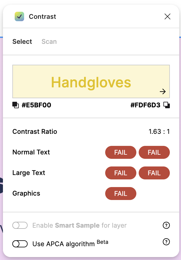
Warning icons were much lighter than success and error icons at the same levelContrast failures
Valid tokens could still combine into pairs that failed contrast requirements.
Warning label on its background: 1.63 : 1, failing text and graphics- Elements:
- 5
- UI States
- ×4
- → 0
- Inverse mode
- ×2
- → 0
- Hue modes
- ×8
- → 0
How can we reduce the amount of design decisions and contrast issues?
Constraints
The palette had to stay. It defined the brand colors and was already used across the product. My scope was the layer between the palette and the components: how components choose colors, not which colors exist.
Exploration
Many CloudGuard components needed the same color hierarchy across several hues and both themes. With the palette fixed, I considered three ways to reduce the mapping work repeated across components.
| Direction | A Direct mapping Use palette colors directly. | B Component tokens Give each element its own token. | C Chosen Strength mapping Use strengths; resolve colors centrally. |
|---|---|---|---|
| Color token example | R-20 | score-tile-bg-danger-default | bg-weakest |
| Avoids repeated mapping work | No: The same palette choices are made in every component | No: The same relationships are redefined for each component token | Yes: Relationships are defined once and reused |
| Consistent across components | No: Each component makes its own choices | Partly: Tokens are stable, but not shared across components | Yes: Components share one hierarchy |
| Adapts to themes and contexts | No: Every mapping is revisited | Partly: Each token gets a value per theme | Yes: Resolved centrally for hue, saturation and theme |
| Stable design–development contract | No: Components reference palette colors directly | Yes: Components reference their own tokens | Yes: Components reference roles and strengths |
| Full local control | Yes: Any element can use any color | Yes: Each element has its own token | Partly: Through overrides, which weaken consistency if overused |
| Quick to set up | Yes: Nothing to set up | Partly: A token for every element | No: Rules to build and validate |
| Changes stay isolated | Yes: One component at a time | Yes: One token at a time | No: Shared changes need calibration across components |
| Decision | It kept every color decision local, so the same mapping work and consistency checks would keep repeating as the system grew. | It gave each element a stable contract, but repeated the same color relationships across a growing set of component tokens. | It let components reuse one hierarchy across contexts and themes. I accepted the initial complexity and broader validation needed for shared changes. |
Solution
I built shared foreground and background strength levels on top of the existing palette. Components use them to set emphasis, rather than choosing a separate color for every variant.
Figma modes control hue, saturation and inverse independently. Each component owns one contrast recipe, and the system maps it to palette colors across every combination and both themes.
Strength levels
Use shared foreground and background levels to express emphasis, independent of hue and theme.
Hue modes
Map the same strength levels across hues so changing color preserves the component’s hierarchy.
Saturated mode
Make text and icons more vivid when color helps distinguish meanings, such as severity levels.
Inverse mode
Flip colors relative to the current theme so highlighted components stand out in both light and dark.
Result
What designers do
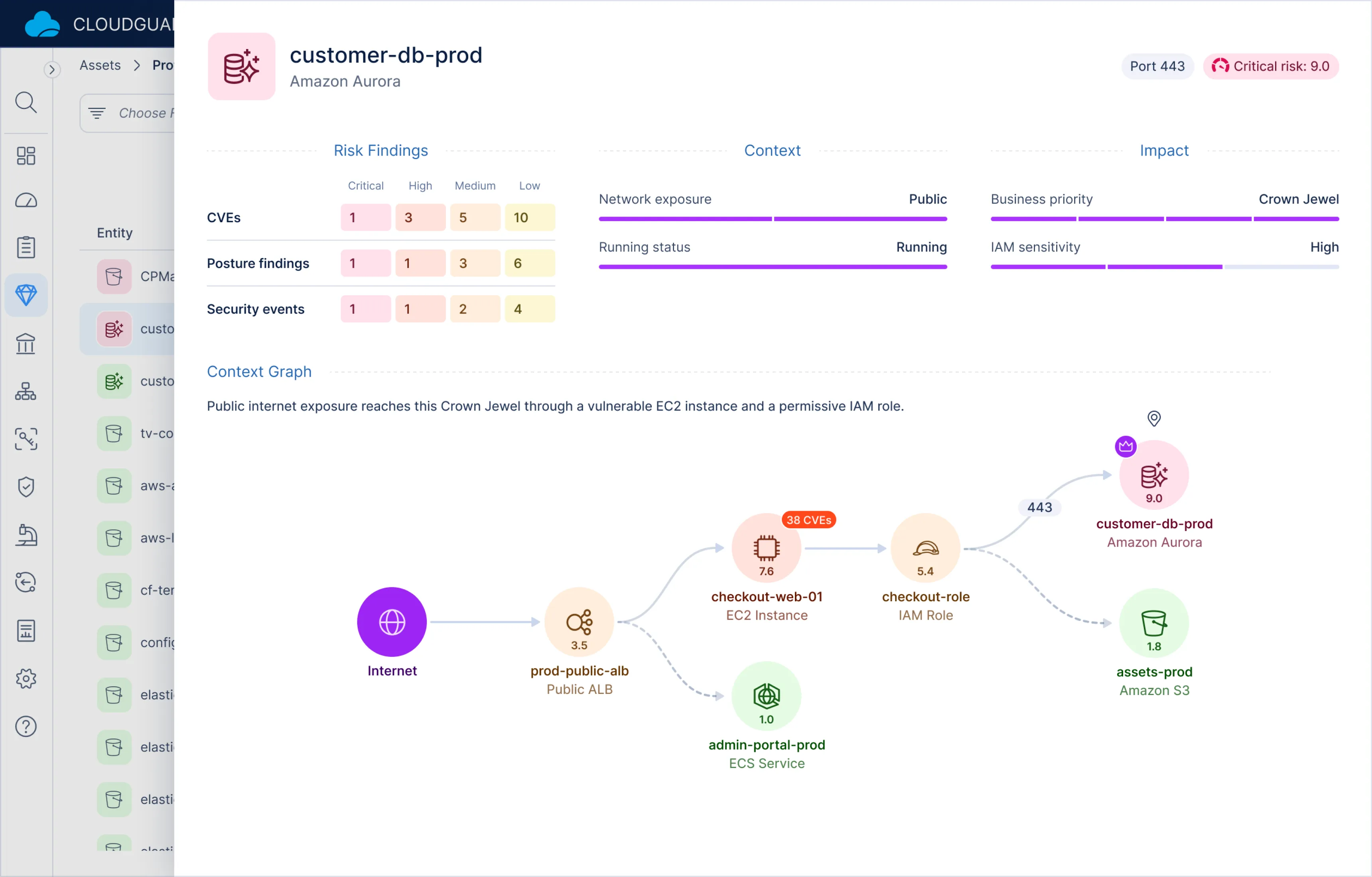
In Figma, designers switch hue, saturation or inverse mode on a single Score Tile. The shared mappings update its colors and keep the same strength recipe, with no tuning per variant.
What users see
Risk, priority and severity share the same color relationships across the screen.
Validation
I checked every foreground and background pair against WCAG AA at eight text sizes. The check covered 192 combinations of hue, theme, saturation, inverse mode, and main background.
In regular mode, every pair on the three main backgrounds passes. Other modes still have failures:
- Extra backgrounds: 5 of 8 hues in light theme, all 8 in dark.
- Inverse, on main backgrounds: all 8 hues in light theme, 5 of 8 in dark.
- Saturated: the most failures, especially combined with inverse.
The check below runs live on the real tokens: change any mode and every ratio is measured again.
Impact
87.5% fewer manual color mappings. In core components with color variants, designers went from assigning eight colors per element, one for each hue, to defining one mapping shared across all eight hues. That keeps the same visual hierarchy across hues.
Zero contrast issues on the three main backgrounds in regular mode. Yellow, orange, and green variants previously had contrast issues across components. The new system passes these checks in both themes. Remaining issues in saturated and inverse modes and on extra backgrounds can now be checked and fixed centrally.