Summary
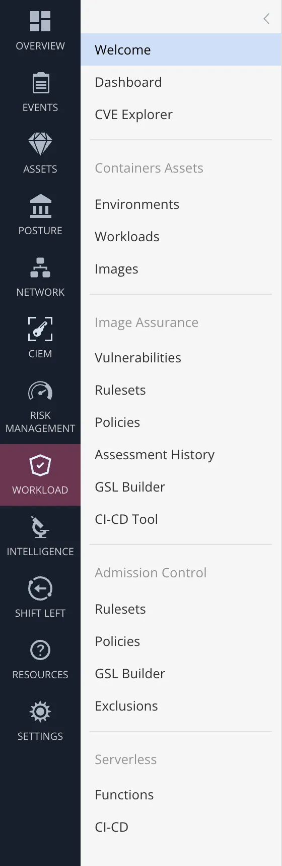
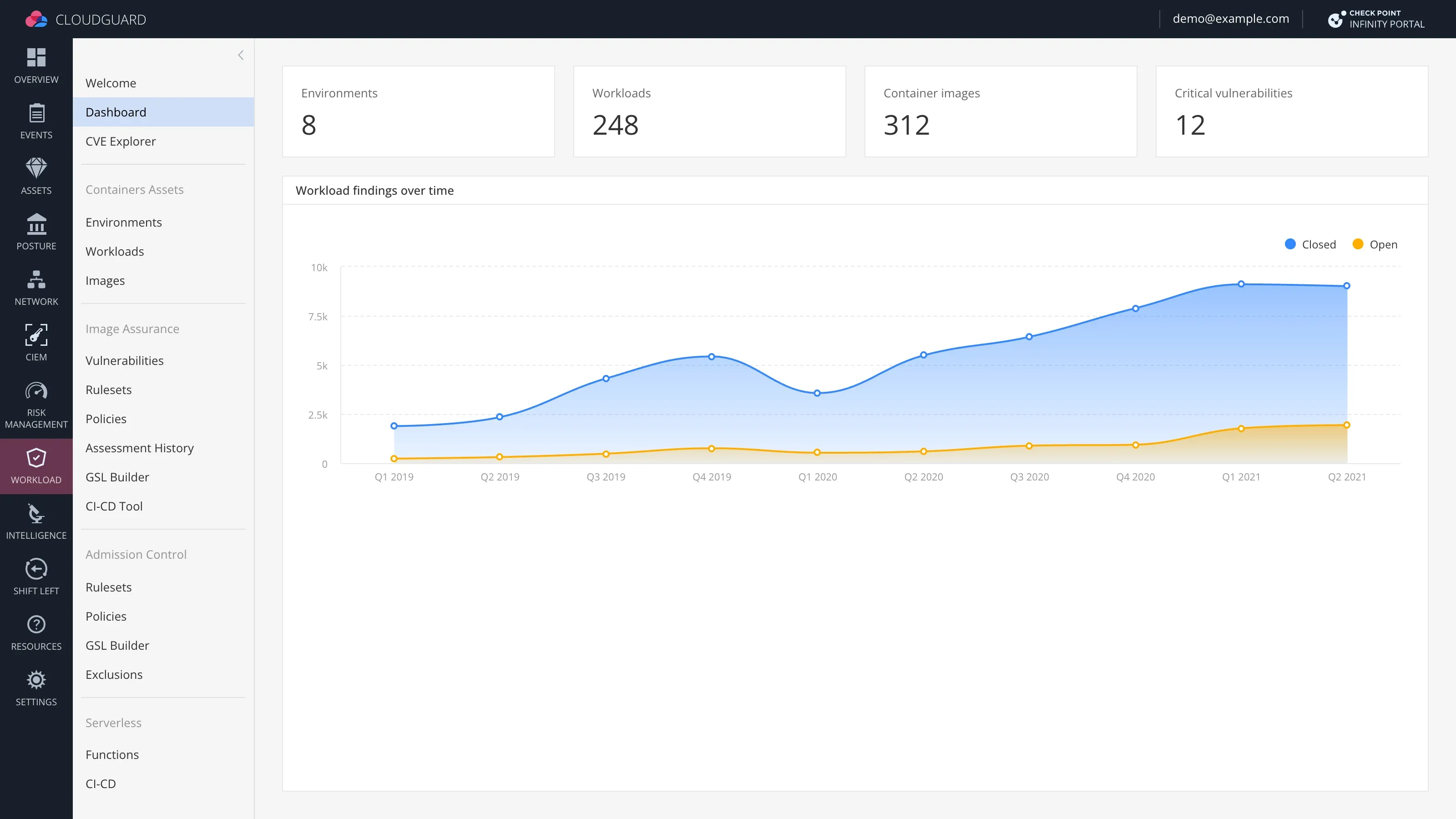
The secondary navigation takes up screen space, makes the UI look complex, and slows users down.
Navigation names, grouping, and hierarchy had to stay unchanged.
An expandable navigation tree with flyouts.
Context
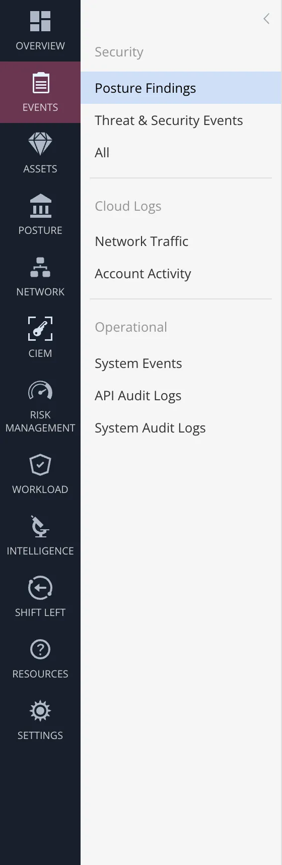
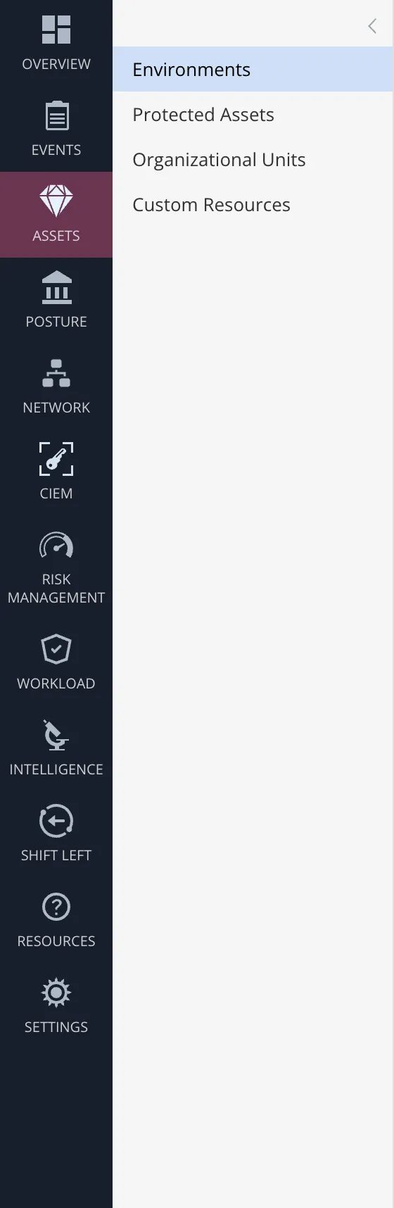
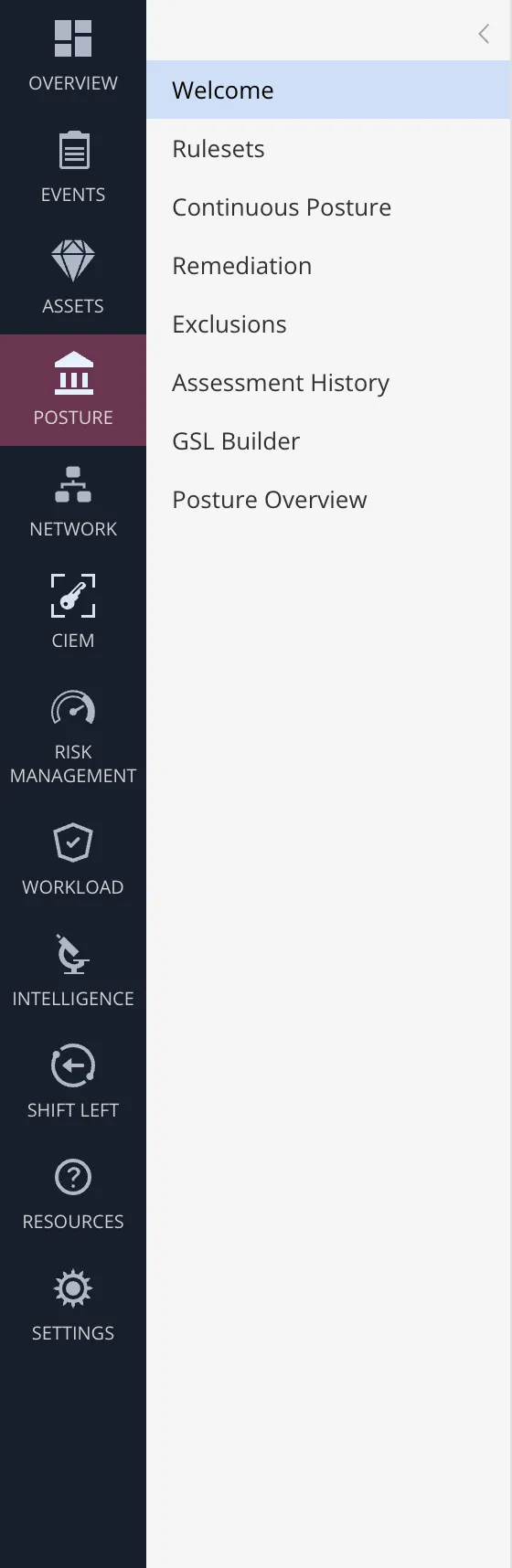
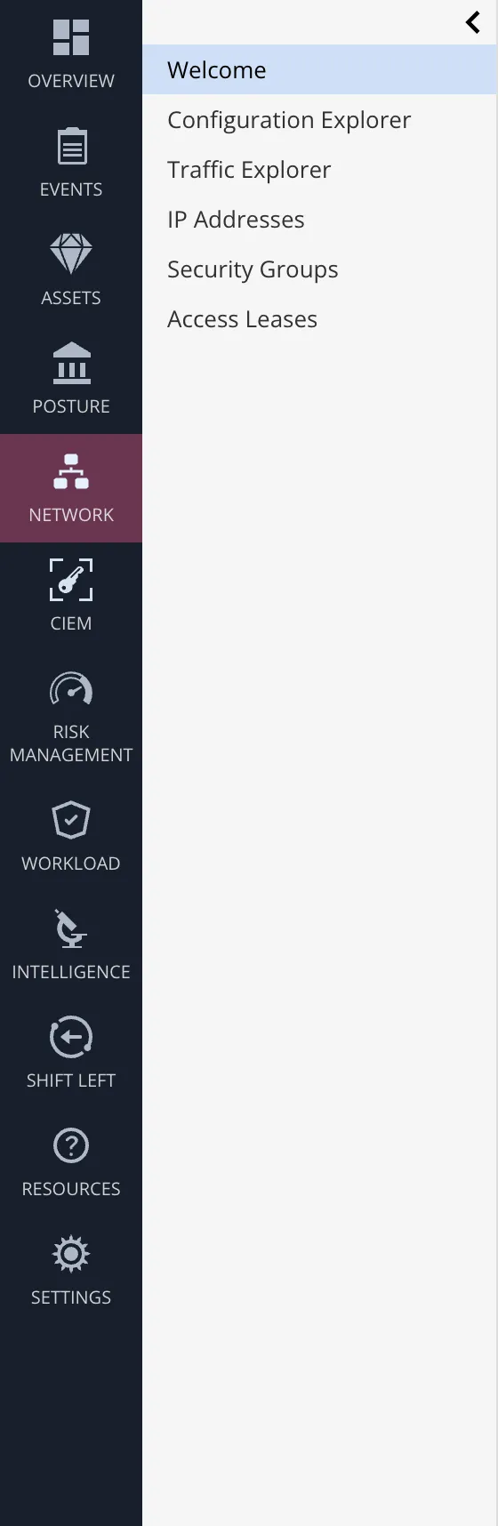
CloudGuard grew rapidly into a complex platform spanning multiple security domains, and its navigation grew with it.
Problem
Crowded interface
Showing two navigation columns side by side makes the interface look more complex.
Less room for content
The second column takes up the same width even when a section has only a handful of links.
A page load for every section
Opening a section loads a new page, even when users only want to see which links it contains.
Constraints
Reorganizing the menu could make pages easier to find. The VP of Product had looked into it and decided to wait. I focused on helping users find pages while keeping their names, groups, and hierarchy the same.
Research
I watched five internal users do their regular tasks and reviewed existing test recordings of three external users.
Users didn’t know the sections they rarely used
Even frequent users had to look around for pages they used less often.
Users checked one section at a time
If they weren’t sure where a page was, they checked the links in one section, then moved to the next.
The second column stayed open
No one closed the secondary navigation during the sessions.
How could we simplify the interface and help users find the right page when they’re unsure where to look?
Exploration
I explored three ways to show a section’s pages. I also wanted the new navigation to support search across sections, so users could look up a page even when they didn’t know which section it belonged to.
Current layout collapsed by default
Navigation tree (collapsed by default)
Flyout
| Direction | A Current layout collapsed by default | B Navigation tree (collapsed by default) | C Flyout | D Chosen Tree + flyouts |
|---|---|---|---|---|
| Shows a section’s pages without opening it | No: You still have to open a section to see its pages | Partly: Only once the tree is expanded | Yes: Hovering previews the pages | Yes: Hovering previews the pages |
| No toggling required | No: Toggle to see a section’s pages | No: Toggle to expand the tree | Yes: Hover instead of toggling | Partly: Hover to preview or expand to browse |
| Room for search across sections | No: The existing layout has no dedicated search area | Yes: Space above the tree | No: The hover rail has no natural place for a search field | Yes: Space above the expanded tree |
| Easy to target | Yes: Plain clicks | Yes: Plain clicks | No: Flyouts need precise hovering | No: Flyouts need precise hovering |
| Decision | It saved room, but users still had to open each section to find its pages. | It made room for search, but users had to expand the tree to see a section’s pages. | Previews were fast, but search had no natural place in a hover-only rail. | Users could preview a likely section from the collapsed menu. The expanded tree gave us a place to add search across all sections. The flyouts still needed precise hovering. |
Solution
The new navigation is an expandable tree with flyouts. To leave more room for content, I made it collapsed by default, since users never collapsed the old column. With the menu collapsed, users still need to know where they are. I added breadcrumbs above the content to show the current section and page.
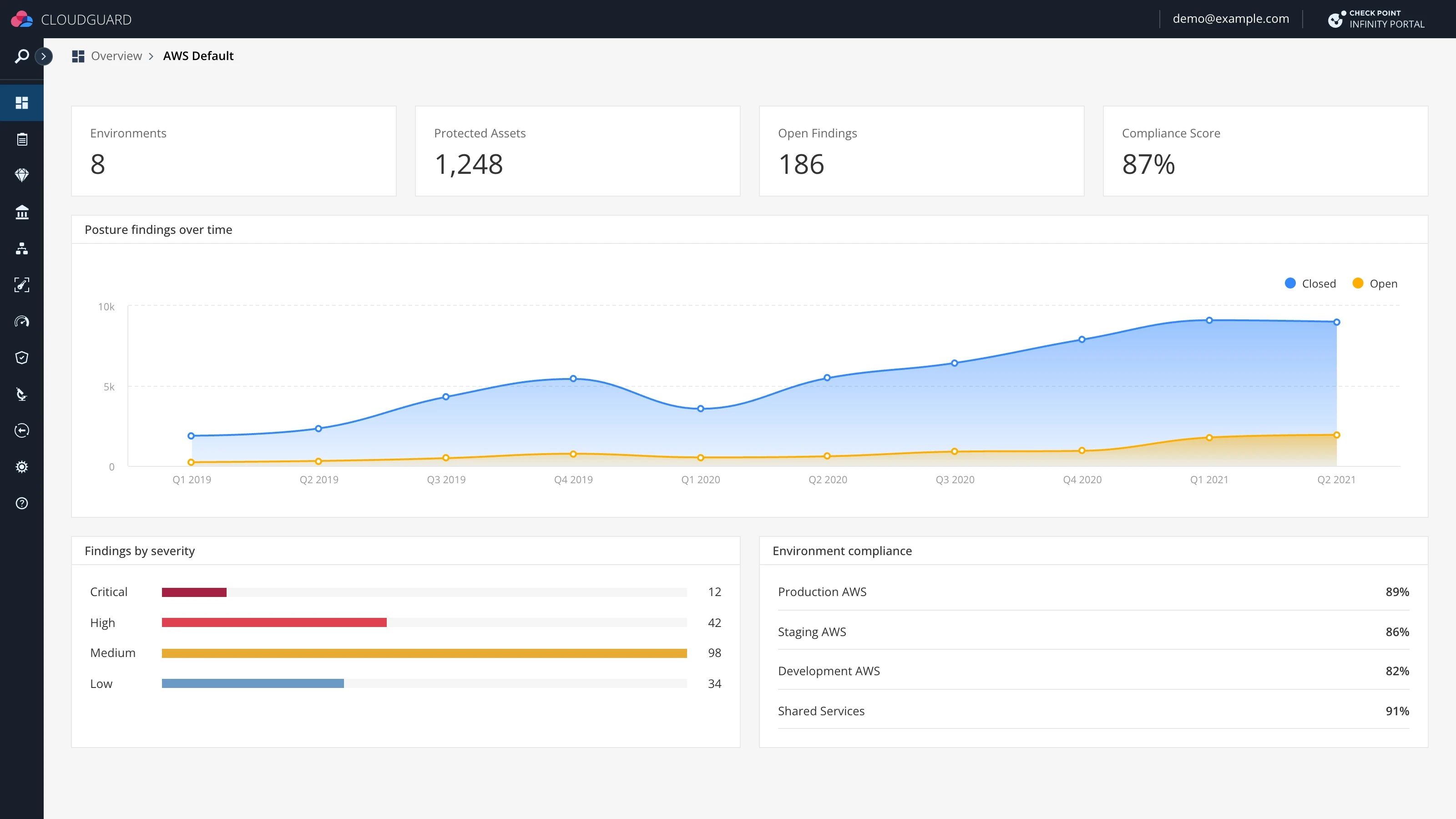
- Collapsed by default
The menu starts as a single column of icons.
- More room for content
With the menu collapsed, the dashboard can use nearly the full width.
- Breadcrumbs
The trail shows the current section and page even when the menu is collapsed.
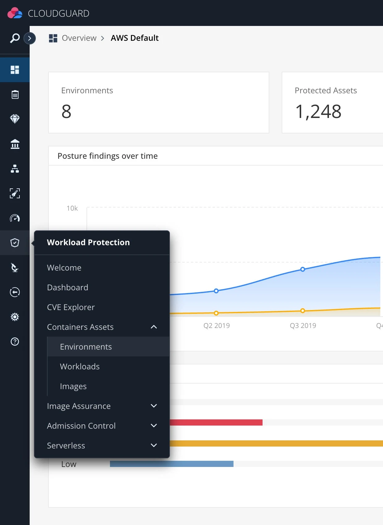
- One branch of the menu
The flyout shows the section’s pages and groups without opening the full menu.
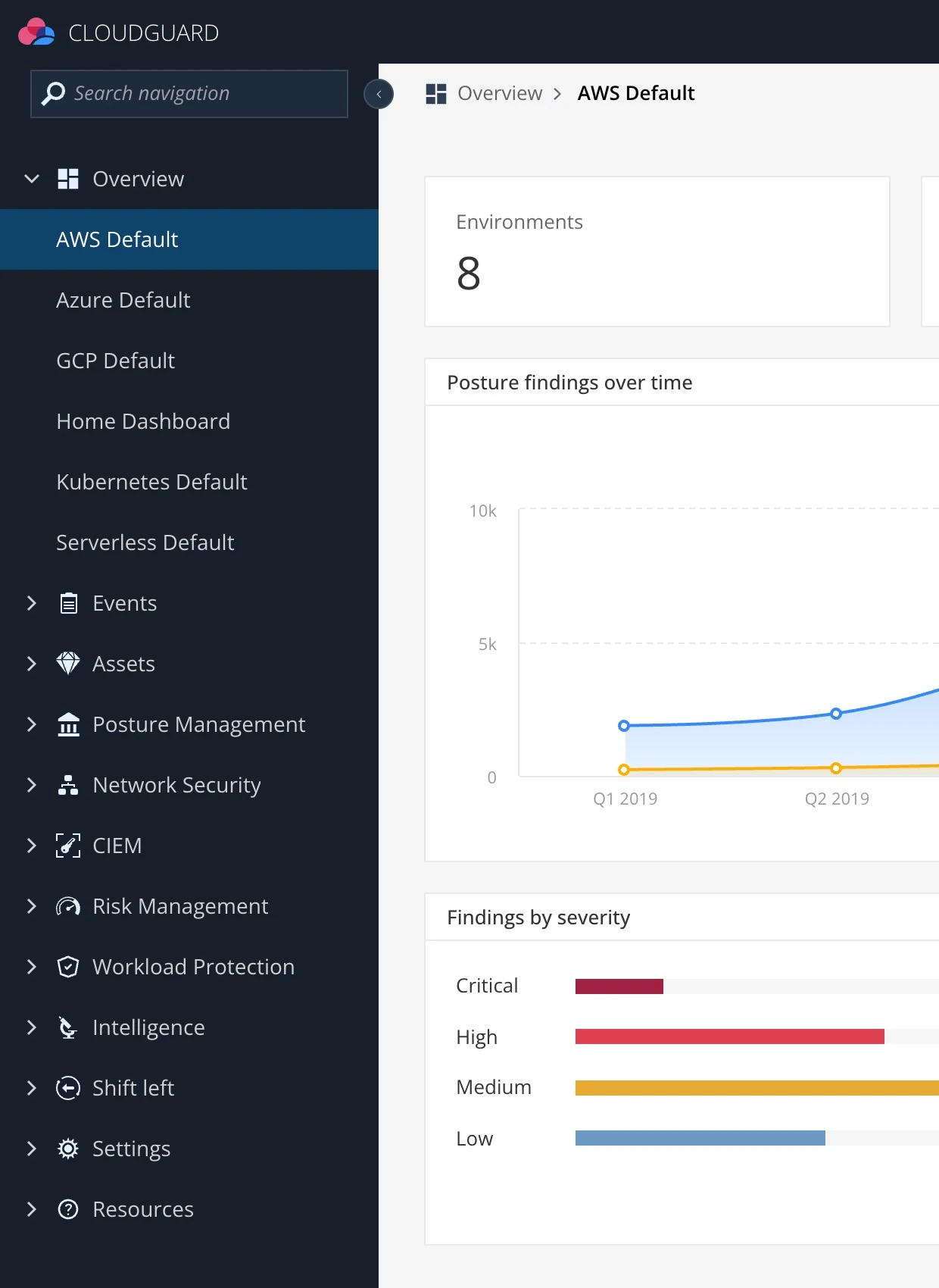
- Full navigation tree
The expanded menu shows all sections in one tree, with pages grouped under each section.
- Space for navigation search
The expanded tree has room for a search field above the list of sections.
Validation
I built a working prototype with real sections and pages. I tested it in two rounds, one with 10 participants and the other with 15.
Keeping flyouts open while users aim
The VP of Product flagged the move from the navigation rail into a flyout as a risk. In testing, users sometimes crossed a neighboring icon while moving diagonally toward a link, causing the flyout to switch or close.
I worked with the front-end engineer to tune when flyouts opened and closed and to define a safe triangle between the pointer and the open flyout. While the pointer moved through that area toward the flyout, the current section stayed open even if the pointer crossed another icon. This gave users room to aim for a link while keeping it quick to switch sections deliberately.
Result
The new navigation is an expandable tree with flyouts. Expand the tree to browse its pages, or keep it collapsed and hover a section to preview its pages while the current page stays in place.
Impact
In testing, 14 of 15 participants said the interface looked simpler, and 8 of 10 said it was easier to navigate. During navigation tasks, users opened one wrong section on average, down from three, before reaching the page they needed.
The redesigned navigation shipped to all CloudGuard users.
The page finally has room for the work.
I can find stuff faster.
What came next
I designed the search flow as a separate follow-up.